September 2024
Welcome to EFM's September Newsletter!
It is essential that every caregiver in the world reads books and does math with their young children!
EFM believes in every child’s mathematical right to equity, opportunity, and personal fulfillment.
News
Mobile App – Available for free in the Google and Apple app stores (as “Early Family Math”), this app now has more languages and more are coming. The app has the original English and a complete translation into Simplified Chinese. It also includes partial translations in Spanish, French, and Arabic. We intend to complete those three translations, and hope to add Portuguese and Turkish soon.
Dr. Wright’s Kitchen Table Math is Free! This three (and a half) book series carefully lays out all the ideas for understanding mathematics up through about fifth grade. The PDFs for these books are now available for free download from the EFM site.
Donations – EFM received a $5 donation on our website from a supporter in Italy. We are very thankful for their support. Please donate or collaborate with us to help improve early math education throughout the world.
Data Analysis for Young Children
Last month I wrote about ways to play with Graph Theory. This month we’ll look at a different kind of graph. Graphing of this sort comes from the desire to represent a collection of data, particularly a large collection, and make it more understandable. There are many other very effective ways to numerically summarize data to make it more easily understood, and we will look at some of those as well.
This topic lends itself to lots of activities you can do with your child involving recording, representing, and analyzing data. It does not lend itself to creating puzzles, though we will describe a few.
Lists, Tables, and Graphs
Introduce data analysis to a young child using lists, tables, and bar graphs. Lists and tables are not usually thought of as graphs; however, they are very useful and related ways of presenting data and should not be overlooked.
Suppose you wanted to study the ten pieces of fruit in your kitchen. You could make a list:
apple, apple, banana, banana, orange, apple, banana, banana, banana, orange
This list can be made a lot more useful by organizing it. Stress the importance of organizing your data whenever you get the chance.
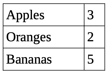
Here is the same information presented in two much easier to understand ways:
3 apples, 2 oranges, 5 bananas
Beginning Bar Graphs and Pictographs
Pictographs are a gentle introduction to graphing. They are less abstract, yet they are a good gateway for using the more abstract ways of representing things. When using pictographs, make sure that the images you use are all the same size – otherwise, the sense of amounts will be thrown off.
Here is the fruit example done first as a pictograph and eventually as a bar graph.
Data can show up in many ways – both from the “real world” and from mathematical investigations. If not handled well, data is just a big pile of hard to understand information. When I taught Discrete Mathematics to high school seniors, I would encourage my students to work on hard problems by doing lots of examples. When they first started using this problem solving technique, they would often end up with lots of good information, but it was in such disarray spread over several pages that they had no idea what they had and how to understand it. Here is an example of that.
The Game of Nim. This 2-player game starts at an agreed upon number, say 20, and the players take turns deciding to subtract 1 or 2 from the current number. The person who lands on 0 wins. The key decision for this game is deciding whether to go first or second. The starting number of 20 is too large to figure out the game strategy directly. Instead, the analysis should proceed by learning from simpler examples seeing whether the first person can guarantee a win or not.
Here are some results gathered from all over the page of an imaginary student’s work:
Starting at 3, you lose. Starting at 7, you win. Starting at 6, you lose. Starting at 4, you win.
Two key organizational pieces are missing here – many simple cases are missing and the results are not presented in an orderly manner. Let’s fill in the gaps and present things in a clear table.
Now it is very easy to see the pattern and start getting a better understanding of the game!
Coastal City Temperatures
I collected the high temperature for the day on one hot summer day in the northern part of coastal San Diego near where I live. I will use fictitious city names of A through G. Here is the data:
(A, 82), (B, 95), (C, 73), (D, 78), (E, 90), (F, 86), and (G, 85)
Data is only as good as how it is collected and presented. This is presented alphabetically, which is great for looking things up by city name. However, there is something interesting going on here in terms of temperatures and it is very hard to see in this presentation of the data. Adding the distance in miles from the coast (the second number in parentheses below), and ordering the data by distance, will make this more interesting.
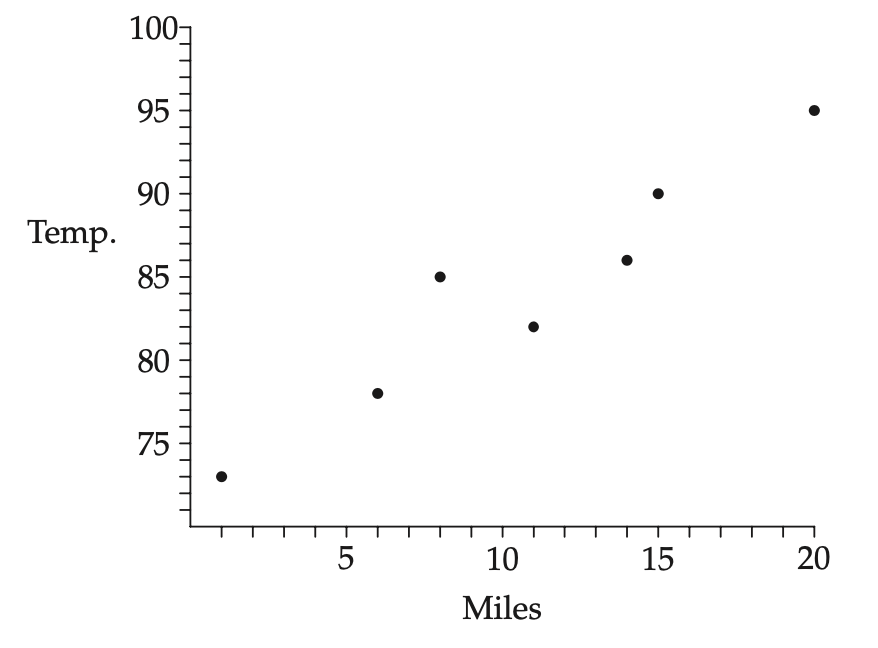
(C, 1, 73), (D, 6, 78), (G, 8, 85), (A, 11, 82), (F, 14, 86), (E, 15, 90), and (B, 20, 95)
Scatterplots
That last list of temperatures makes it clear that the temperature is generally going up as the cities get farther inland. However, if we use a scatterplot, the relationship becomes much clearer. Scatterplots are what most people think of when they think of a graph, and they can be very useful. You can do lots of examples of scatterplots with your child: graph height versus age; graph daily temperatures for a week; graph energy used in your home versus the high temperature for the day.
Here is the scatterplot graph of the coastal city temperatures on that hot summer day. Using this scatterplot it is very easy to see that the temperature not only increases as the cities go inland, the temperatures do so increasing by about one degree per each extra mile inland. Making it easy to understand data and see relationships is the goal of data analysis.
Averages and Descriptors
There are at least three kinds of averages: mean, median, and mode. However, when someone says “average” they are almost always referring to the “mean.”
The mean of a group of numbers is the sum of all the numbers divided by how many numbers there are. For example, the mean of 4, 8 and 9 is 7, which is 7 = (4 + 8 + 9) / 3. It is useful for your child to realize that if you multiply the mean by how many numbers you have, you will get the sum of the numbers.
At an intuitive level, it is also good to realize that if you take the mean and find the differences with it, the differences all balance out. Here, 7 – 4 = 3 balances with (8 – 7) + (9 – 7) = 1 + 2. Another intuitively useful property is that if we add (or subtract) the same number with all the numbers, we increase (or decrease) the mean by that much. For example, the mean of 24, 28, and 29 is 27 = 20 + 7.
The median is the number in the middle, similar to the median of a highway going down its middle. The median of 4, 8, and 9 is 8. If you have an even number of items, such as 4, 8, 9 and 9, then the median is the mean of the two middle numbers, which in this new case is (8 + 9) / 2 = 8 ½. The mode is the data item that occurs the most often (if there is one) – this average is not used very much.
There are other useful descriptors. What is the largest and smallest value? What is the median of the bottom half of the data and what is the median of the top half of the data (these are called quartiles)? Box and whisker plots use these descriptors, but I will not be doing anything with them here.
It can be very intimidating to get a feeling for a dataset with 10,000 pieces of data. However, if I simply tell you the smallest value is 5, the median is 18, and the largest value is 22, then with just those three numbers the dataset can start to come into focus – it is a dataset that is top heavy between 18 and 22. That is the point of having these tools – to quickly summarize a large set of data to make it more understandable.
Puzzles
It is simple enough to ask a child to find the mean and median of a dataset. While such a question verifies understanding, it is often not very interesting to calculate. Look for more open-ended questions that will allow your child to think more deeply and engage with the concepts in more interesting ways. Here are a few examples.
Suppose you have 5 positive whole numbers whose mean is 6. What is the largest value one of those numbers can have? What changes if I tell you one of the numbers is 3? How small can the largest value be and still get a mean of 6?
Suppose you have 5 positive odd numbers whose median is 7 and whose largest value is less than 20. How large and small can the mean be? What are all the possible values for the mean? Is it possible for 8 to be the mean of these numbers?
You have 5 positive whole numbers whose mean is 6. What positive whole number would we need to include with these 5 numbers to get a mean of 5 – is it possible? Instead of that, how about a sixth number that produces a mean of 7? Which means can we produce that are whole numbers?
Find 5 numbers from 1 to 20, using no number more than once, so that the difference between the median and mean is as large as possible. Do it again making the difference as small as possible.
Wrapping Up
We’ve looked at various ways, both visually and numerically, of representing a collection of data to help understand it. Data analysis opens a new way for your child to engage with all the numerical information that is around them all the time. Next month I will write about fractals, which is a different way of producing some amazing visual effects. It may change the way you look at the details in the world around you.
If you have any questions or comments, please send them our way! We would enjoy the opportunity to chat with you. Also, if you are interested in collaborating with us or supporting us in any fashion, we would love to talk with you about ways we can work together!
September 18, 2024
Chris Wright
Chris@EarlyFamilyMath.org
Twitter | Facebook | Instagram
Early Family Math is a California 501(c)(3) nonprofit corporation, #87-4441486.


